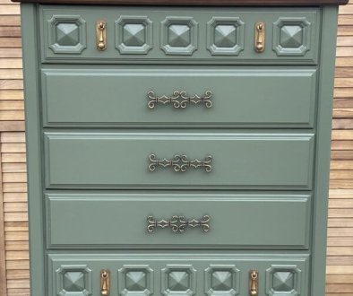
Brittany’s Vanity Makeover

In a text message a special friend asks for a vanity makeover. I drag my feet responding. The piece looked good as it is. It goes against my moral code to paint anything but roached up pieces. She persisted so I finally visit her place to take a closer look.

Pictures can be deceiving. Even in my own experience, photographs can make my furniture look better than it is and worse. In this case, you can not see the permanent defects and damage that only paint or stripping would cure. So, we spent a good hour or so mulling over design options and ideas.

The Plan
It’s like decorating a room: start with the comforter or wallpaper then work out from there. For furniture makeovers, we start with the transfer (or decoupage print). Brittany chose “Dahlia Forever” by Redesign with Prima, an excellent choice especially for her desire to keep the basic color of the piece the same.

We met up at the local Sherwin William store, (my favorite paint brand for making chalk paint). Brittany found the color that matches existing tone and compliments the transfer. Good going Brittany! I love working with others because I am introduced to new ways of looking at design. Paint Color: Sherwin Williams Golden Gate. Here’s a link how I make DIY Chalk Paint.

I went to work cleaning and prepping. Trending these days is a natural wood top surface but you can not design it in until sanding is complete. I’ve learned the hard way, you never know what lays hidden under a finish! This top sanded perfectly! It’s gorgeous! No surprises.
How to keep the raw wood showing AND make it be the same color as the body called for using the Paint Washing technique and it worked!


First Draft
A few things are not hitting the mark. The drawer hardware back plates were glued on the drawers. There was no choice but the apply the transfer over them. I did a splendid job manipulating the transfer but it didn’t look right. Argh! How is that like life: doing a excellent work on the wrong decision. Yeah, the mirror color, though one could learn to live with it, looks gaudy and an overall detractor. I appreciate Brittany’s courage and honesty to speak up. It’s just not working she says. As the painter, and in life in general, I have a tendency to stick to the plan regardless. Re-doing work for any reason is no fun. Settling for mediocre is no fun either.

Testing 1, 2, 3
Brittany consulted with her Mom and partner. I think I should consult with them in the future too!
Final Draft
Now, it’s easier on the eye and has a softer look that is doing the piece justice. Much better! Take a look at the hardware . . . better too! Correcting for them involved a 3 step process: detail painting over the transfer using acrylic gold paint, apply and wipe brown paint glaze to get the dimension needed and, lately a bit of gold gilding wax sparkle.

An Introduction to Fabric Painting
The chair was a dilemma. Upholstered back with piping is not in my wheelhouse for replacement. I’ve never painted fabric before. It appeared the only option for getting any kind of improvement out of the chair. The seat however . . . posed a tragic obstacle. The fabric was not just stained but torn and ripped in many places. Somehow I had to find a way to re-cover the seat with a matching (or close to it) fabric then paint them both (seat and back) without any differences between them. That is a tall order but lesson learned . . . place priority on getting a super close match of COLOR so that when both are painted any differences are slight. Though the back has a textured print, the seat does not. But it doesn’t bother the design much at all, not like a mismatch of color would be. Whew!


