Blue and Green Furniture Makeovers
Start With The Blues


Cool Hardware
This was a roadside score with missing hardware. I take a very long time searching for hardware online to find the perfect style. I adore the bump of twisted style this hardware gives a bland front dresser. Yeah, I could have used popular bar modern handles. It may have sold faster. Sandwich colors: SW Coffee Bean (the darkest brown) and Tempe Star in Emerald enamel.
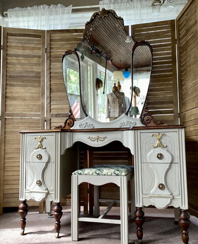
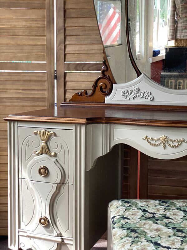
Strong Princess
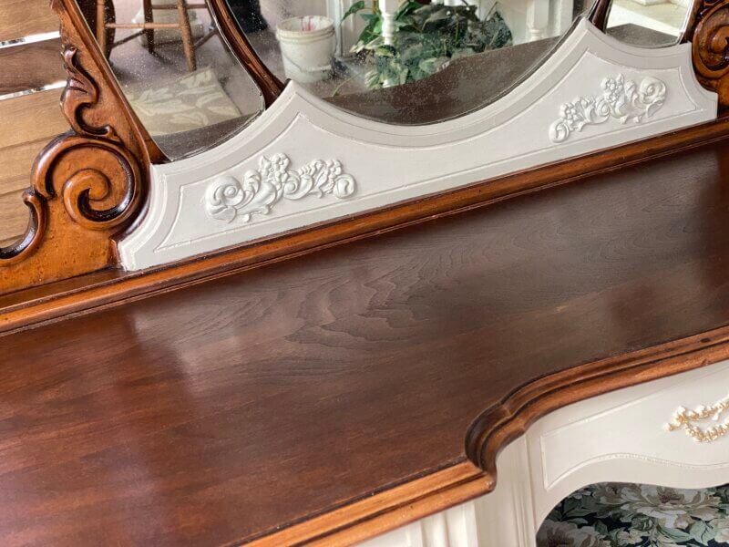
I love the result of using a more masculine color on a girly dresser. The floral french provincial hardware HAS to stay with french provincial pieces, especially this one with the front vertical texture. The top is faux wood finish using milk chocolate paint color and dark chocolate glaze. SW Tempe Star mixed with black I called “dark star”.
Squared Off Bottom
Cutting off one-dimensional scallops from the bottom skirt is a game changer to modernize a very dated piece. Had there been use of bar hardware, it would have sold faster. Now that I look at it months later, I’m not sure why I did use them.
Trending Green


MCM + Jasper = WOW!
Cedar chests are slower sellers except this one. It sold within the day. It has great MCM bones. Black would have looked great too, but Sherwin Williams Jasper color checks all the marks for a great 2025-26 color. No, this hardware is not original. I can’t believe how perfect two separates can come together.
Sage
Subtle design on drawer fronts created with paintable textured wallpaper, brings some fashion to this federal style dresser. The bottom skirt is also cut creating ‘legs’. Faux keyholes applied plus SW Green Onyx. Not sure why it took a couple months to sell.
The Start of My Obsession With 70's Spanish Revival.
I saw the potential as soon as I found at Habitat for Humanity. The 3 pull handles are not original but the tear drop ones are. I find one of a kind hardware on Ebay. (Post a thing you don’t need, someone out there could use it.) Wood top and bottom are re-stained and finished. The color is a mix of Jasper and Green Onyx and I am in love with it! Apparently another person liked it to. It sold within the week.