Slowly my paint inventory is transitioning from lighter colors to darker and from chalk style paint to Sherwin Williams Emerald brand. I’m loving it’s no-top coat properties. Top-coating is my least favorite part of furniture makeovers due to easy to miss drips and runs plus the streak potential. The Emerald brand glides on super easy and leaves no brush strokes. It makes me look like I know what I’m doing – lol.
Recently, I took home Sherwin Williams Jasper dark green paint. Greens are on-trend starting last year. It is also my favorite color! I’ve been careful to avoid the olive green military green though which is why I leaned on this one.
New Color
Only 2 things were done to take this cedar chest from boring to an attractive accent piece. SW Jasper did a great job bringing this piece into this decade and I owe a lot to the perfect hardware find at D Lawless Hardware.
New Hardware
It was a very lucky mistake! I had neglected to fill the old hardware drill holes in the bottom drawer prior to paint. They are a 4 in center to center pattern so I thought it would be easy to find the bar handles I had in mind. It was not. I searched the internet high and low for 4 inch handles. It took me several looks at these to decide that the pillow effect of them match perfectly with the chest ‘pillow’ rectangle panels. They are spray painted in hammered bronze and gold highlighted using rub n buff.
This rare executive desk gets a posh makeover for a stylish, ‘can’t wait to use it everyday’ home office. I’ve never seen a vintage double sided desk in a smaller size before let alone one with twisted wood detail around the top.
It was shoved against the wall when I found it so I didn’t see that the back was finished until I got it home to paint. That means it can be placed in a room facing the door. Can you see it? This desk frees you from facing the wall and gives some breathing room.
Work Plus Style
KellaChic looks to do a little more than solid color furniture make-overs. The back of the desk is a blank canvas to add lots of embellishments like decoupage, transfers and/or, paper clay details. I’m practicing restraint lately. Though the possibilities are plentiful, color blending alone gives enough style and wow factor. The base color is Naval (using my personal paint recipe). Side and back panels are blended using Vermont Slate, a yummy deep teal used on this cedar chest.
More About this Desk
Navy Executive Desk
DOUBLE SIDED DESK – it looks great in the front AND has a beautiful back. You are not stuck against the wall!!! Smart and stylish.
Painted Navy Blue with subtle slate highlight blending; 4 drawers each side plus top drawer.
Twisted desk top detail border all around; highlight shimmers.
Matching chair freshly padded and upholstered with matching plush navy animal print.
Original hardware.
DIMS: 44 wide x 30 tall x 23″ deep
Price and Location
$350 Painted by KellaChic – inside Timeless Treasures Mason MI Open 7 Days 11 am – 6pm
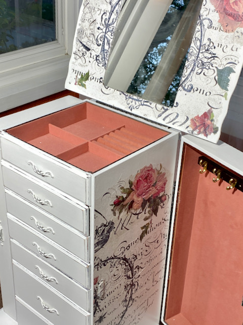
White chalk painted jewelry armoire is the definition of Shabby Chic. It’s shabby distressed on the outside and french chic on the inside.
Family has taken a front seat to my painting endeavors this fall and probably for the rest of the year. While in the midst of moving parents to assisted living, my days can spare a hour hear and there. Previously one was finished every week easily. Now, one piece might take more than 10 days. It has taught me to shed the part of this hobby I ruined by treating too much like a business. So I was prepared to accept the lowest monthly sales check ever: $15.44. Didn’t bother me a bit.
Today I’m happy if I get a chance to paint. Come to think of it, that is enough.
Kelly Miller
All my pieces get more love and attention lately, like this jewelry armoire. The design was developed as I went.
About Me
I am a sturdy modern solid wood armoire that delicately stores family jewels, craft or art supplies. Primed and chalk painted white then pleasantly distressed.
6 little drawers perfectly lined in pink felt
2 side door openings for hanging necklaces and dangling things with peek-a-boo french shabby chic styled decoupage paper.
Flip top opens to store more artfully styled with decoupage and vine stencil
Original hardware painted white then distressed
Trimmed using tissue decoupage inside and top; light gray/white stripes on sides only; dry brush for a authentic vintage shabby age look.
All top coated several application of the best water based protective product: General Finishes High Performance Flat also sold in Windy Hill Market.
Price and Location
$145 USD. See it inside Windy Hill Market, 217 N. Jackson Street, Downtown Jackson MI. Open M-Sat 11 am to 6 pm
You can imagine this sturdy toy box looked blah in it’s original laminated particle board state. Dull brown with fake wood grain and orange brownish vinyl top, it’s very functional but no one would want it in a bedroom or playroom. Painting a toy box is a bit out of my wheelhouse but it really needed my help!
This Hokus Pokus transfer is my inspiration; perfect for a goal to create a makeover not too baby toddler style but one that’s fit to last through to the teen years. Normally transfers cost $25-30 each but for some reason this one cost only $10 plus shipping. Cool design great price, good for me!
About Me
Toy Box painted “November Sky” blue to help keep a clean room and make Mom happy
Re-upholstered textured ‘faded denim’ color soft fabric from JoAnn, padded for use as a bench too!
Transfer ‘100 degrees South’ from Hokus Pokus
On wheels
Dimensions and Location
Dims: 39 long x 18 wide x 18 deep –
For Sale $150 – Inside Windy Hill Market, 217 N. Market Street, Downtown Jackson
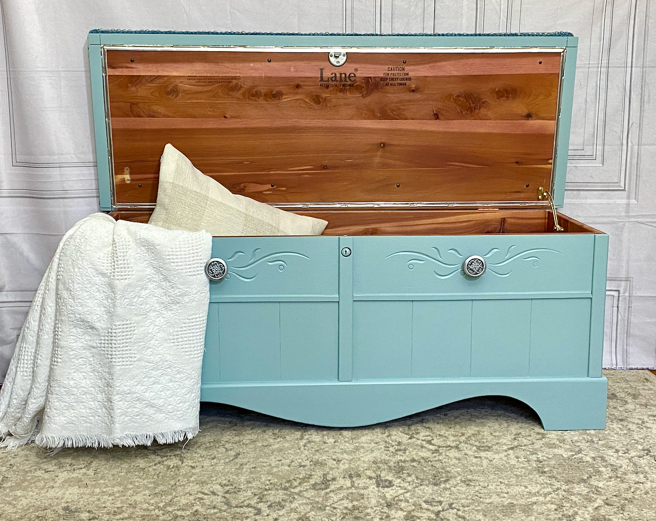
I am a Lane Cedar Chest totally made over from the 70’s to a formal classy style. Painted with General Finishes Milk Paint Persian Blue. Several applications High Performance Top Coat in flat sheen
Reupholstered using Chenille ‘Mardi Gras” textured fabric.
Embellished for timeliness classic style using tack strip on the lid
New shabby chic knobs sprayed Hammered Pewter
The lock is removed for child safety though the lid is heavy.
Lots of storage inside for boots, blankets, precious keepsakes. Use me as a bench, hope chest, or toy box.
The most exciting element of a cedar chest up-cycle is selecting the bench cushion fabric. It’s my new favorite furniture to transform.
In the 60’s and 70’s, it was a right of passage for every teen girl to receive one. Cedar chests were also called Hope Chests. This one is straight from the 70’s.
Fabric First
Yay! A trip to JoAnn’s. The best fabric for reupholstering the bench top is in the Home Decor Chenille aisle. It’s sturdy, durable and covers the seat evenly. Though there is huge selection, there are doubts about using single layer calico cotton, unless the thread count is high. I love using textured solids but I chose a print for this one because the chest is small (twin sized) and won’t overwhelm it.
Pick Paint Next
The fabric provides inspiration for paint color. All the colors in the fabric were considered. I really wanted to go for the blue color, I chose to go with the beige background but a few shades darker: cohesive with a little contrast.
Change the Hardware – Yeah, can we get rid of the 4 eyes on this thing? Who’s idea was it to put 4 stupid bat wing handles in the quadrants? Probably an engineer – wait I’m one! Cheeeesy. Frankly I’m ignoring the quadrants. The original handles need to go bye-bye and the holes filled.
Instead, 2 vertical handles would look nice in the center. I just happened to have saved a pair from a previous up-cycle. Yay!
Adding Paper Clay Details – just in the corners to add a bit of french femininity and to soften the front canvas. My usual mistake is to get carried away with these details. On Project Runway they call it “editing” yourself. I get it and I did.
Break Up The Big Space – with paint blending. It adds interest without being flashy. I’m not a fan of the blending process but I love the result. It takes me 3 do-overs to get it right.
Big Reveal
Paint color choice worked! I’m glad the lighter colors weren’t used. The center highlight blending gave some needed drama. Centering the hardware is super exciting and the little embellishments in the corners all work together. No more quadrants, you can’t even tell they were there! Yeah, baby.
Painting and glazing highly carved wood antique secretary desk – see the step-by-step transformation.
Tia Marie is the owner of an outstanding carved and highly detailed secretary desk in search of a makeover. It is especially fun to post progress of commissioned work in real time to enable the owner to view progress and share with friends.
The Plan
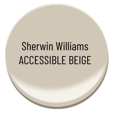
Tia Marie and I both adore Sherwin Williams colors. The names they give colors combine words that have nothing to do with color. The one selected for this project is Accessible Beige. Um OK. It is a cool color, slightly lighter than what the end piece will end up.
Next comes an application of black antiquing glaze over top of the paint to highlight these carved details . It’s a brush on wipe off technique that gives depth and dimension.
Final embellishment is gold gilding wax over the peacock. Do you even see the peacock on the front panel in the before picture? I’ll sweat bullets applying the gold. One wrong move and the project is toast.
Prime and Paint – That’s the Easy Part
Ready or not, here it comes . . . .except this is what I call a ‘brush burner’ project. It takes swirling clockwise and counterclockwise to get into the carvings. It’s a slower process for sure. Loading up the brush with too much paint is risking drips and runs. There are none. I passed that test.
Glaze Effects
Want to see a transformation into something dramatic? Just glaze it. BUT FIRST, before any glaze is applied the freshly painted surface must be prepped to take glaze. Glaze is a brush on wipe off technique so, there is nothing is worse than brushing on glaze and not being able to wipe it off, which is what happens without a barrier application of topcoat.
There’s a double the risk for runs and drips. Topcoat is thinner plus it foams up with too much brush movement. A chip brush is smaller width and bristle wise. It allows me to get into the carvings without the need to swirl so much. Yeah it was tedious but on a cold winter day with nothing on the calendar, it’s a perfect slow-me-down project.
I am trying something different this time. Instead of the flat sheen top coat I have on-hand (always) I tried semi-gloss (which I never have on-hand). My hunch is it would provide more slippery surface and longer workable period for manipulating glaze. So, me and my golden-doodle Dash took a walk to the neighborhood ACE about 1.5 miles from home. It was good to get out of the house.
Yeah, I’m happy with the process and results. Careful application of semi-gloss topcoat with the chip brush was helpful. General Finishes Pitch Black glaze acts like a stain and takes a good rubbing to wipe it off for the desired effect.
There she is . . . all parts painted and glazed.
How to Highlight the Peacock on the Front Door?
Tia wants the Peacock highlighted the carved Peacock. Checkout the progression of first adding gold gilding wax (Rub N Buff). It’s nice but not very dramatic. After careful consideration blue guilding wax is added in search of some wow factor. I think we found the wow. It’s a conservative wow, very tasteful.
Door – painted and glazed
Gold highlight added to Peacock and bird on the left.
Blue gilding wax added
Makeover Complete
Though the base coat is Accessible Beige, it looks white in it’s home environment. Lighting is everything!
Cedar chests are an unsung hero in bedrooms and living rooms everywhere. Not only do you get cavernous storage for blankets, toys and whatever, are a functional bench AND, they can add some real style fashion -with a little paint. This one made me very happy to makeover using colors focused on flexibility for any color room. Classy, bougie, savage.
Bench Cushion Cover
I strategically bought the cover fabric first and then used it to select paint color.
I avoided selecting a too trendy pattern. Why? Because I wanted staying power for this piece. Styling too trendy or specific can lead to a kick to the curb in a short time. My hope is to offer an update that will last in the “still love it after all these years” category.
I also stayed away from styles that seemed grandma dated and old. Cedar chests already get a bum wrap for being dated in the first place. So, I concentrated on solid colors with lots of texture. Selection further narrowed down the color to this creamy beige neutral for decorating flexibility and staying power. The wow factor that made this one a slam dunk choice is its texture. I fell in love with the soft cozy comfy feel of these teeny tiny pillows. Found at JoAnn’s, it was expensive and it was on sale – double winner!
Paint Color Strategy
Choosing paint color is the number one hardest part of restyling furniture, hands down. It has to be trendy but but not too specific. It has to be attractive to many people not just a few. Like why is the ivory colored farmhouse hutch still not sold? Sometimes I just can’t understand retail.
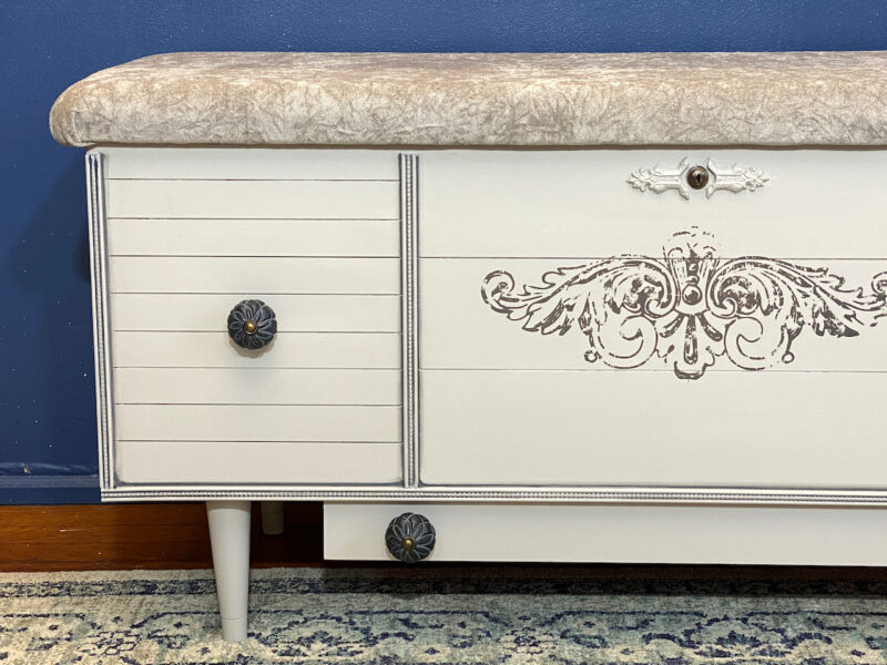
The main paint color is narrowed down by creating a styling vision ahead of time such as glaze effects, dry brushing, decoupage, distress or stencil. Distressing is almost always an attractive option however the fan and raised frame panel details caught my eye to highlight them using dry brushing. That idea directed me to a paint color a few shades darker than the fabric color. That way there, dry brushing highlights would pop. The exact color in my brain could not be found in a pre-mixed chalk or milk paint so, I fell back to making a terrific DIY chalk paint recipe that opens up my color choices. Rustic Oak by Magnolia Homes found at my local ACE matched the fabric and my vision.
Style Treatment Effects
Dry brushing is my pre-planned choice to highlight the raised fan and panel frame details. I use a cheap chip brush and newspaper. I take a dab of paint on the brush and brush most of it off on the newspaper. What is left, you would hardly say is any, gets brushed on the top of the raised details ever so gently and sparingly. Getting carried away is easy that is why you also see dry brushing on the fake doors and bottom skirt!
However, the inside panel frame section took an empty-needs-something look. Using transfers and stencils is ruled out because of the difficulty to get it right. It’s very hard to maneuver them inside a frame. Decoupage would be a perfect technique there. After “trying on” the decoupage paper designs on hand I head back to JoAnn’s.
No flowers or specific images again. Something nondescript, so I choose script! It has a timeless and trendy feel. Combined with the dry brush highlights, it gives this piece an edge.
“Eye-Liner” Final Paint Technique for Dimension
This is the first use of the eye-liner technique to provide depth dimension to detail. It is a darker version of the Rustic Oak base color by adding a bit of black to it. Liner is applied using a thin craft watercolor brush on the inside corners. It’s a thin straight stroke. I’ll continue to work on this technique blending and smoothing it better. In the meantime, it really enhances the whole piece. It gives it some oomf!
Hardware With or Without
The piece came with drawer pulls installed on the fake drawers. As usual, I went about my business choosing a color or metallic spray paint. The pulls looked much better with hammered gold paint.
Before thoughtlessly re-installing and poking holes in the decoupage paper I took a pause to decide, does the hardware really enhance the look? I thought, not really but the tug-of-war was strong to install them anyway just because they are original to the piece. I phoned a friend. She agreed, with the hardware, the piece looked dated and returned to being a grandma piece from the 80’s. No bat wing drawer pulls, please.
So this is the finished re-styling of a dark gloomy looking cedar chest, ready for the next generation home. Sold at Windy Hill Market 217 N Jackson Street, downtown Jackson next to Pedal & Tour.